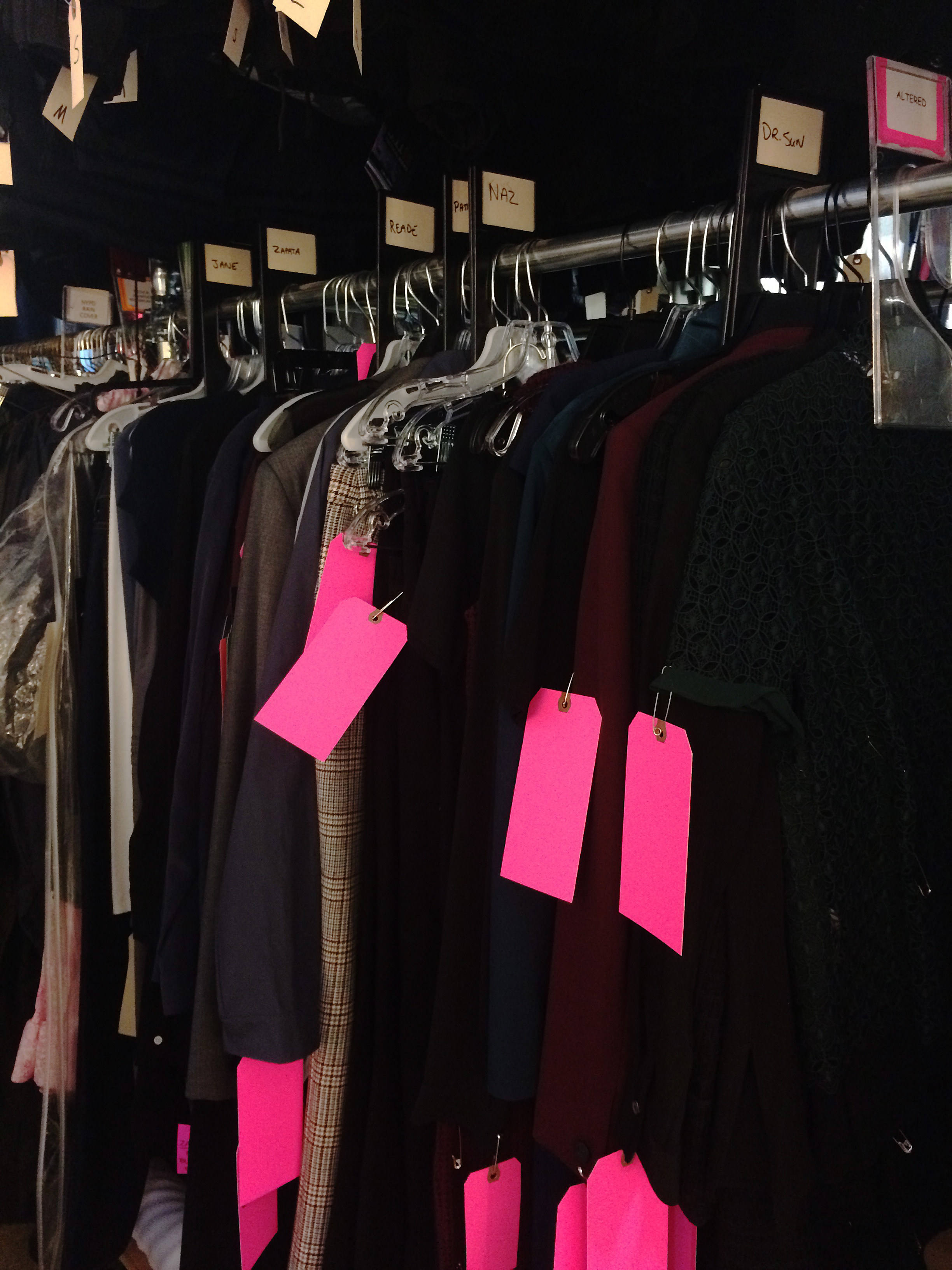
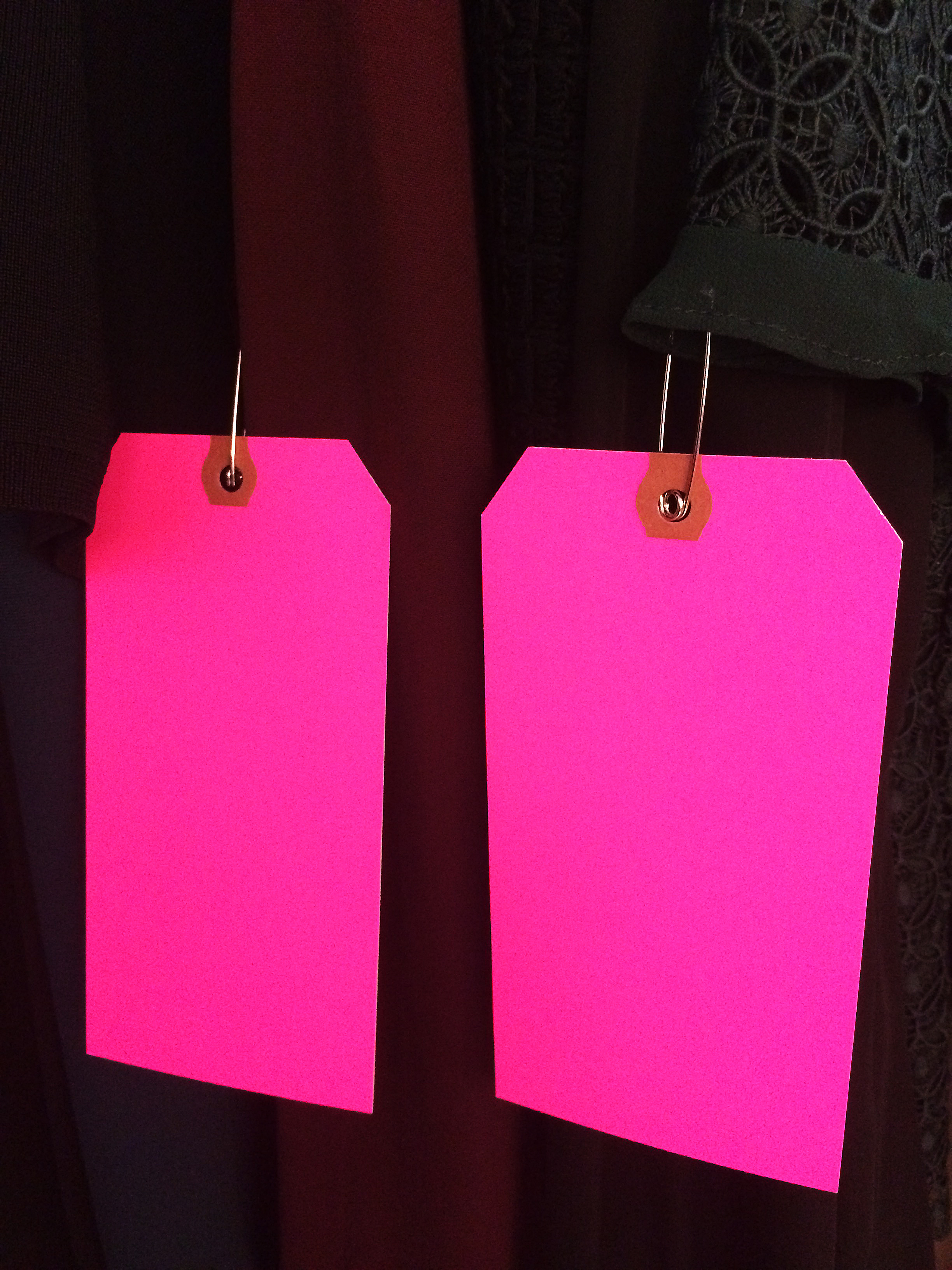
Most film and television costume departments in New York City use bright pink oak tags to identify a garment as needing an alteration.
Most film and television costume departments in New York City use bright pink oak tags to identify a garment as needing an alteration. Larger (and usually period) shows, like Boardwalk Empire, The Deuce, The Get Down, have two or three Costume Fitters who run the fittings for the background actors. They keep everything organized in the fitting rooms, take measurements and photos, assist the designers, do a lot of the pinning (unless something really wacky is going on, then they’ll usually call the Head Tailor in to check it out), and write the alteration notes on the tag.
Inevitably, a high percentage of alteration notes will read something like: “Take in as pinned” or “CB as pinned”. ‘CB’ means center back if you didn’t know. And ‘AP’ is the abbreviation for ‘as pinned’.
So, anyway: “Take in as pinned.”
Measure twice, cut once.
Take in as pinned
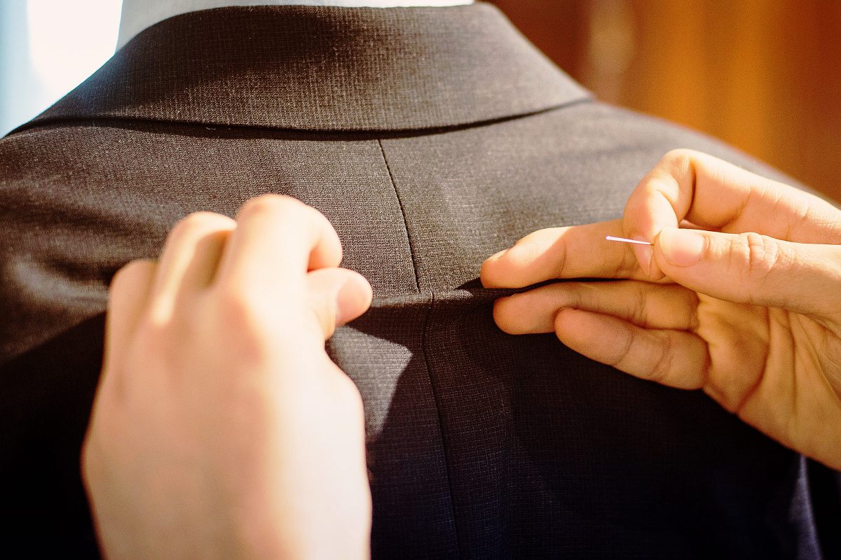
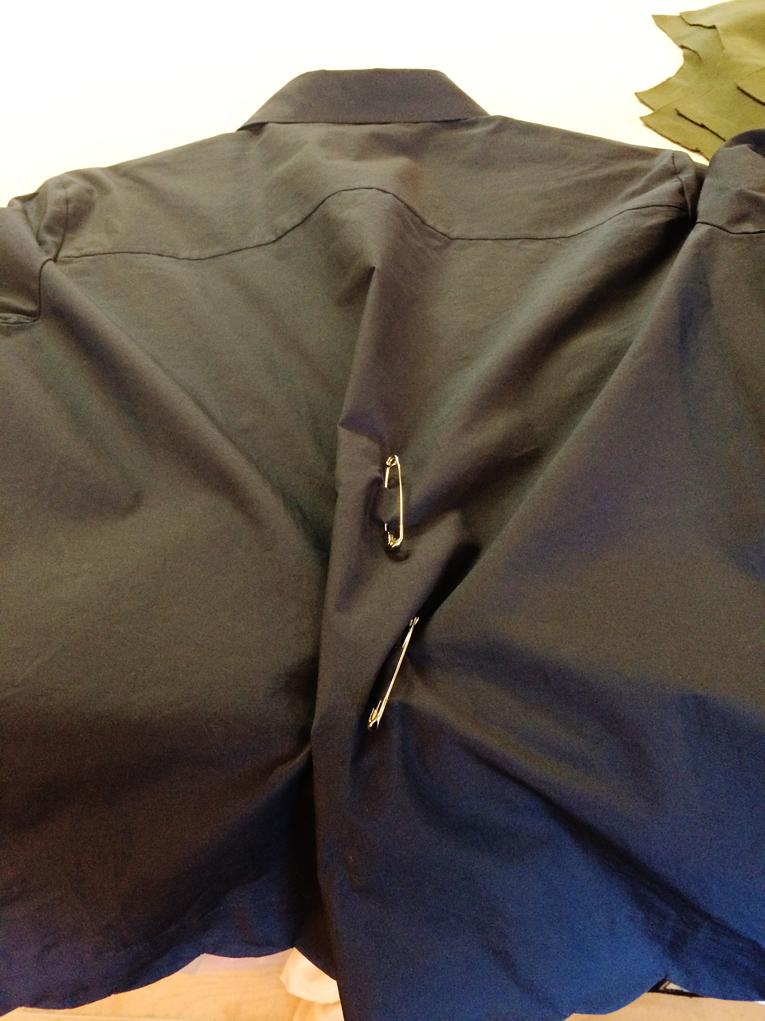
Here’s the thing, even if I pinned the alteration myself in the fitting room, ‘take in as pinned’ shouldn’t necessarily be followed literally. Seriously. It is indeed true that humans in general are not always symmetrical but it’s rare that you honestly need to take in one side more than the other. I also cannot tell you how many times an initial, “he has one arm longer than the other” turned out to be a jacket not sitting evenly upon the shoulders.
The garment can, of course, be lopsided to begin with – always a possibility if you’re dealing with vintage clothing. Measuring is always a good idea. As my Dad always says, “Measure twice, cut once.” He was talking about lumber and carpentry but the same advice applies to sewing as well.
I usually mark (or just measure) the pinned out alteration with chalk or wax on the wrong side of the garment. Then I take the pins out and assess the situation. If two side back seams were pinned in and one is considerably larger than the other, even them out. Do the same thing on both sides.
This is actually one of the top five laws of sewing – if there are laws of sewing.
I just pin everything out in through the center back then figure out later the best place to take it out.
I often only pin one side of a thing. More often, I just pin everything out in through the center back then figure out later the best place to take it out. A large amount will look better if you distribute it through more than one seam.
For example, if you pinned out 5 inches at the center back waist of a shirt or jacket, split the amount up between the center back, side back and side seams. The end result will look much better.
An alteration I do a lot is taking in the backs of men’s button front dress shirts. Unless it’s a slim cut John Varvatos, most men’s dress shirts are excessively roomy in the back. The quick and easy solution to this is to add side back darts.
If I have time, and the shirt has back pleats going into the yoke, I’ll take the whole back off and take out the pleats – re-cutting the bottom part of the armseye and the side seams. This can take quite a bit longer, especially if you are dealing with a shirt by Brooks Brothers, who insist on gluing their side seams as well as sewing them.
Take in as pinned.
Speaking the same language
At Blindspot, since I’m the Head and only tailor, we just put blank pink tags on the garments as indications that they need altering. If I pinned it, I don’t need any notes. The Costume Designer for the show is also an excellent tailor (which is rare) so if I wasn’t in a fitting for some reason, he can easily tell me what needs to happen – often without pinning.
He’ll come to me and say, “I threw this on so and so, it just needs to be taken in about this much in the back.” Then he’ll show me by pinching an amount out with his fingers.
Tailoring and patterning is indeed a language all its own and it’s a beautiful thing when you work with someone who speaks it as well as you do.